Awareness training programs frequently encourage users to report emails as phishing if they suspect anything unusual.
For example, if the From address looks shady, or if the email message itself appears to invoke a sense of urgency, or warns of some sort of pending problem unless action is taken immediately, then users should report the email to IT, or the anti-phishing group.
 In fact, one of the most common phishing attacks seen in corporate settings uses a lure1 that warns about account storage overages, and encourages the victim to login and take action. If they follow the link in the lure, they’re taken to a landing page2 where their username and password are compromised.
This scam has many flavors, some focus on email, others focus on file and document storage, or even cloud-based services.
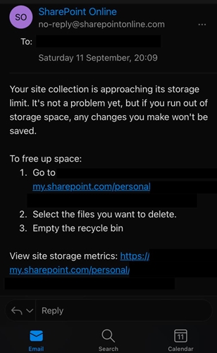
This leads us to the image over on the right of this page.
Is it legitimate, or is this a really crafty phishing attack against Microsoft SharePoint accounts?
Examining the email:
Looking at the email, the first thing that pops out is the From address: no-reply@sharepointonline.com. It just looks like something an attacker would use.
Frankly, it looks shady. One would expect that business related emails or account notices would either come from internal sources (like the IT department), or Microsoft directly, using known domains. In this case, known being a domain that is instantly recognizable such as microsoft.com. While many Microsoft 365 users and administrators might instantly know sharepointonline.com, there are plenty of others who will not.
If you were to try loading the domain in a proxy source like URLScan.io, it fails to load. Based on the From field alone, if someone were to report this as a possible phishing attack, it would be completely understandable.
Looking at the body of the message, again you see a possible red flag. The message is promoting an urgent matter. While it does downplay the situation "It's not a problem yet", it still presents as a thing that needs attention now, and offers links to your SharePoint account. Again, if someone were to report this as a possible phishing attack, they’d be right to do so.
But is it?
Is this a phishing attack?
No. It isn’t.
This is an official Microsoft email
In January 2016, Microsoft stated that they were making a “subtle change” to the From field on notification messages sent from SharePoint in Microsoft 365.
This change should reduce the risk of SharePoint notification mails being routed to the Junk Email folder and should cause no adverse effect… These messages will have the same display name (such as the person who is doing the sharing), but will always use no-reply@sharepointonline.com as the From address.
So the format of the message, the shady looking address in the From field, the tone of the message - all of it looks wrong and feels wrong, but it’s completely legitimate.
So why then, does this message hit all of the red flags often discussed during awareness training?
Because criminals craft their messages to look like the legitimate ones, and sometimes there is overlap. More often than not, this overlap is intentional. Especially if you’re faced with a phishing attack that is conducted by a knowledgeable threat actor.
So the awareness training isn’t wrong. Microsoft isn’t wrong for how they’ve formatted their message.
The reality of the situation is, criminals have gotten good over the last few years. Phishing emails have come a long way from where they were in the early 2000s or even the 2010s, when spelling mistakes and other formatting issues were frequently spotted, rendering the scam useless. Sure, all that still happens today, but it isn’t the norm.
What can Microsoft do?
Nothing really.
Their email is perfectly legitimate. They could add a better address, but criminals will spoof it. They could use icons and official imagery, and criminals will spoof those too.
One thing they could do, if you wanted to be picky, is make the email notifications match app-based notifications. This creates alignment. Get an email, but didn’t get the same notice in SharePoint itself? That’s a red flag. But as things stand now, no such overlap exists. It also assumes that people use the application regularly. You’d be surprised at how many people don’t, but still get messages like this.
Another possible change, but one that would be hard to get implemented in my opinion, is to make it so official notifications don’t have a single link in them. Just a warning to login to the application or service directly, and address whatever issue there is. The problem? Usability.
There is a trade-off between security and function, and in order to make it easier for the user to address issues, links to the relevant application or service are provided.
Leave the links, you create the risk that someone will click a malicious one at some point. Take the links away, and you eliminate the risk at the expense of users ignoring warning messages, or complaining about the additional workloads.
(I know, I know. Opening an application or service directly doesn’t seem like a lot of work, but to some people it is, and they will speak up about it. Rightfully so. When it comes to security trades, and usability is a factor, the user will - and always should - win. Especially when the users are customers, which is what we are to Microsoft.)
What can defenders do?
Encourage reporting, and be prepared to thank users for their false reports. It’s going to happen. If they report emails like the one in this blog, thank them for their awareness and explain that it is legitimate. Encourage them to keep reporting emails any time their gut tells them something doesn’t feel right.
But the most important advice, train them to avoid links in the message and go to the source.
Again, sticking to the example in this blog, teach the users to go to their SharePoint accounts directly and confirm that space is running out. They can do that without ever touching a link sent via email, social media, or instant message.
Create an internal portal that links to resources like SharePoint in a clear and secure fashion, so staffers know where they are and what they are accessing. You can even combine this process with something that works with your identity management program.
But if nothing else. Just keep encouraging the awareness and reporting. It’s worth dealing with a few false reports on the off-chance that a legitimate attack is stopped.
Footnote:
Header Image: Araki Illustrations - stock.adobe.com
-
A lure is what entices the victim into accessing the included phishing link. Often this can be an alarming message sent via email or SMS, or a post on social media. The key is that the criminal has created a sense of urgency, alarm, or curiosity in the victim, thus getting them to commit to accessing the link. ↩
-
A landing page is what is displayed when a victim accesses (clicks) the phishing link within a given lure. ↩
That's all for now.
![-[30]- a.k.a. The End](https://steved3.io/images/sig.png)